
Never try to discourage yourself! Everyone has the ability to draw! You just have to learn to EXPAND on what you already know!
Let's take a sun for example. The basic shape is commonly...well, a circle and some lines to signify rays. Pretty simple enough, right? Now you can easily EXPAND on this. You can keep the circle and draw solid fiery shapes to substitute the lines. Or as one of my schoolmates calls them, "Hot Cheetoh Flames." You can expand even more from this ability and create something a bit more realistic (or abstract if you want to; it depends on what you're trying to aim for). A lil' blending here, a lil' shading there, and we have a cool sun. Yay :D
Most artists I know start drawing by copying or tracing another famous artist. Me, I started drawing Naoko Tachimura's art when I was young. It's a good way to start if you're a beginner, but there are some downsides. For example, nothing you 'draw' will ever be original. In this case, if you ever trace or copy, NEVER claim that the art is 100% yours. Once you have a good feel of drawing a certain style, practice it on your own, and maybe tweek at it here and there. Never build your art abilities solely off of tracing/copying. We're not seeing how well you can draw. We're seeing how well you can trace.
Once you're got a grasp on drawing, you'll probably want to learn how to color as well. I'll be explaining how to color on the computer in this tutorial. Let's start with some more basics first though. Consider which coloring style you would like to use before you start coloring. Everyone has their own unique drawing style, but that doesn't mean you have to stick with only one. For example, a refined portrait might look best with a watercolor technique while a cartoony, dynamic character might look best colored with cell-shading. Experiment; try and visualize which style would work BEST for your picture. Don't just practice with only one!
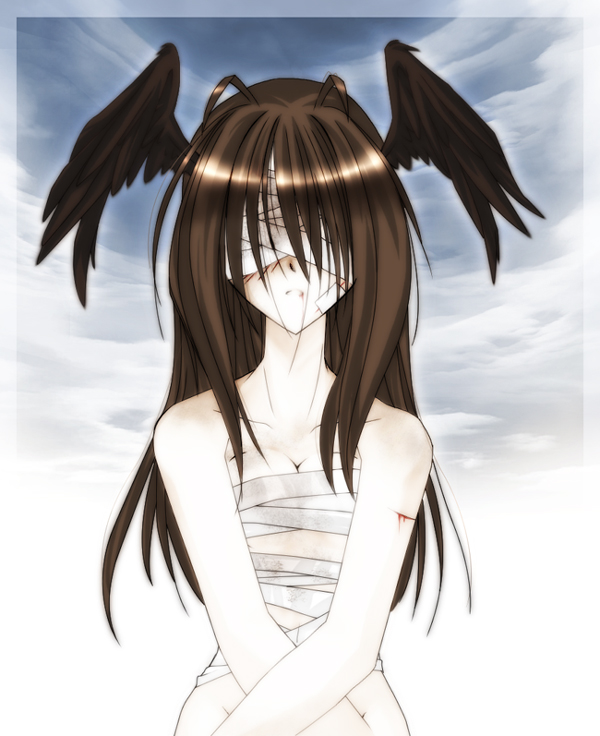
"Judgment" When I colored this picture, I wanted and airy-ethereal feeling when I colored this picture, while maintaining a slightly dark style at the same time. You can see the color of the skin is really obscure and washed-out, while the other colors are bold and rich. Notice how the lines are still black (although thin). This is to draw more attention to the object of the portrait.
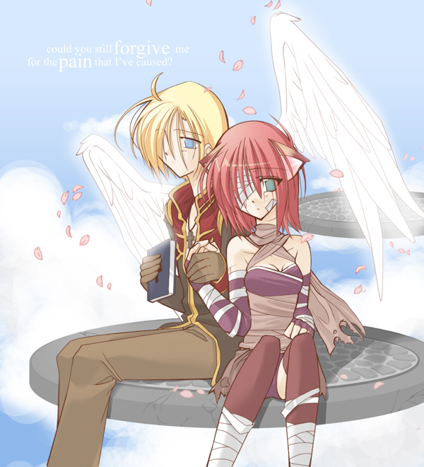
"Forgiven" This particular picture also has a light-airy feeling to it. To achieve this effect, I combined the use of soft and bold coloring to create a slightly more realistic style. However, since the background is realistically-based, I thickened and colored the lineart a deep mahogony, 'else the background might be a bit overbearing to the eye.
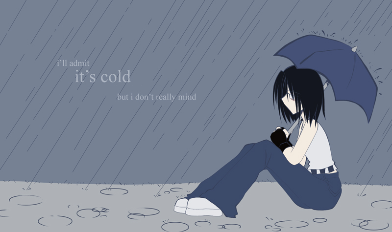
"Rainy Day" I was inspired by those cartoony characters you see in calenders, like the Ziggy cartoon. The idea of this picture was to have a "Lonely" feeling, so I kept totally solid colors, no shading whatsoever. Notice there are very little details in this picture as well. The lines were thickened to maintain the cartoony-effect, and colored blue to go with the color scheme.
move onto step .o2 >>