The background can be what makes or what breaks your overall CG. Visualize and try to see what background will fit your picture the best. It can be realistic or abstract, it doesn't really matter. Try to stay away from cliche-ed backgrounds (like the cloud effect under the Filters>Render tab, or the 'grass and sky').
Anyway, I thought a nice blue scheme will work nicely with this picture. I also thought it'd be best to use a slightly abstract background as well.
First, I'll start off with an image I found off google.com. (click to see) Take that image and drag it into your CG. A new layer should be made with the image on it. Drag the image under your character. Now Transform it. Go to Edit>Free Transform (shortcut Ctrl+T) and drag the corners of the image tohave it fit your canvas.
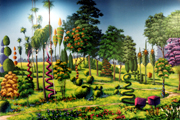
Now, go to Edit>Adjustments>Hue/Saturation (shortcut Ctrl+U) to change the hue of the image. It's a bit dark, so I decided to lower the opacity (you can also use different layer effects, like Hard Light, to get a cool shiny effect).
Whatever else you do is totally up to you. I added some more layers. One I filled with blue and used the Rough Pastels filter to get a cool lines effect. Add some more images, text, and voila! This is my finished result.
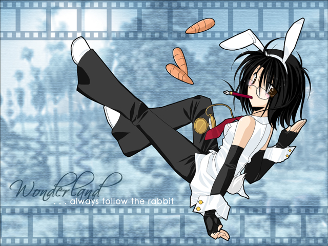
Were're done! Give yourself a pat on the back! (and move onto Step o6 if you'd like to see some tricks)
move onto step .o6 >>